


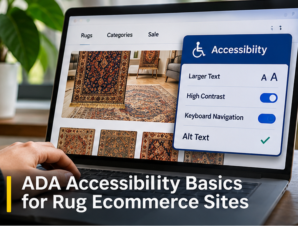
When we review accessibility on a rug ecommerce site, we do not treat it as a checkbox that can be completed by installing one widget or adding alt text to a few product images. A shopper may need to search hundreds of rugs, open filters, compare product photographs, select a size, understand price and availability, use a wishlist, complete forms, and move through checkout. If any important part of that journey depends entirely on vision, a mouse, color perception, precise movement, or an interface that assistive technology cannot understand, some customers may be unable to use the store even though the website looks polished to the development team.
For U.S. businesses, accessibility also has a legal dimension. The Department of Justice states that Title III of the Americans with Disabilities Act applies to businesses open to the public, including retail establishments, and has consistently taken the position that the goods and services those businesses offer online must be accessible to people with disabilities. At the same time, DOJ’s guidance for private businesses does not prescribe one detailed technical web standard that automatically determines Title III compliance, and it identifies standards such as WCAG as useful technical guidance. We therefore use WCAG 2.2 as an important practical accessibility framework while recognizing that technical conformance and legal compliance are not always identical questions.
We Start With the Actual Rug-Shopping Journey
Our first accessibility test is not simply running the homepage through an automated scanner. We follow the same journey a customer would follow and ask whether each step remains usable with different input and assistive technologies. We search for a rug, open a collection, apply filters, inspect a product gallery, read specifications, change options where applicable, add the rug to the cart, and move through checkout. We also test contact forms, financing information, trade-account applications, showroom appointments, wishlists, popups, account login, and any other path that can influence a purchase.
This journey-based approach matters because many accessibility problems appear only after someone begins interacting with the store. A homepage can receive a strong automated score while a size filter cannot be operated by keyboard, a product gallery traps focus, or a checkout error is communicated only by turning a field border red. The Department of Justice specifically recommends considering keyboard access, headings, color contrast, text cues, zoom, accessible forms, and manual testing alongside automated tools.
For a rug ecommerce site, accessibility therefore needs to cover the complete purchasing system rather than only the pages that receive the most organic traffic.
We Use WCAG 2.2 as a Technical Framework
WCAG 2.2 is the current W3C Recommendation for web-content accessibility and contains testable success criteria intended to make web content more accessible to people with a wide range of disabilities. The guidelines cover areas involving visual presentation, keyboard access, navigation, forms, interaction, multimedia, input assistance, and other aspects of digital experience.
For most commercial projects, WCAG Level AA is commonly used as a practical target when teams are trying to improve accessibility, although the appropriate legal requirements can depend on the business, jurisdiction, contractual obligations, and applicable law. We do not tell a retailer that receiving a particular automated WCAG score guarantees ADA compliance, because DOJ itself warns that an automated tool reporting no errors does not necessarily mean the website is fully accessible.
Instead, we use the standard to create repeatable technical requirements and combine automated testing with keyboard testing, screen-reader review where appropriate, zoom testing, form testing, and human inspection of important purchasing journeys.
Product Images Need Useful Alternative Text
Rug ecommerce relies heavily on photography. A single product may include a full rug photograph, styled room scene, border close-up, pile detail, reverse-side view, fringe photograph, condition image, and scale reference. We therefore think carefully about what information an image communicates rather than automatically placing the product title into every alt attribute.
The primary product photograph may need alt text identifying the rug type, significant colors, design, and another visually important characteristic. A close-up image might instead identify the border detail or pile texture if that information helps the shopper understand the product. Decorative images that add no meaningful information may be handled differently so screen-reader users are not forced through repeated descriptions that add no value.
We also avoid turning alt text into an SEO keyword field. Our image SEO guide applies here because useful alternative text should first communicate the purpose and relevant visual information of the image. Keyword repetition that makes the text awkward can reduce the accessibility of the page rather than improve it.
Color Cannot Carry Important Information by Itself
Rug sites naturally use color throughout the shopping experience. A filter might show beige, navy, green, and red through visual swatches. A form may mark errors in red. Available and sold products may use green and gray indicators. Promotional pricing may use one color while standard pricing uses another.
We make sure important meaning is not communicated solely through color. A sold rug should have text indicating that it is sold. An invalid form field should explain what needs correction rather than merely changing the border color. Color filters should have accessible names that identify the actual colors.
The DOJ specifically identifies text cues alongside color as an accessibility consideration and explains that users who cannot perceive color still need to receive the information being communicated.
This often improves the shopping experience for everyone because clear labels remove ambiguity even for users who do not have a disability.
Text and Controls Need Sufficient Contrast
Elegant rug websites sometimes use pale gray text, subtle beige buttons, muted labels, or text placed directly over lifestyle photography because the design looks refined. Those choices can become difficult to read when contrast is too low.
WCAG 2.2 contains specific contrast requirements for text and certain interface components. Rather than choosing colors visually and assuming they are readable, we test actual foreground and background combinations against the relevant success criteria.
This is particularly important for prices, stock status, filter labels, navigation, form instructions, buttons, and text overlays on hero images. A secondary design element can sometimes tolerate subtle presentation, but the controls required to purchase a rug should never disappear into the visual design.
We Test the Entire Store With a Keyboard
Some users navigate without a mouse, so we test whether every important interactive feature can be reached and operated with a keyboard. That includes menus, search, filters, sorting controls, product cards, image galleries, modals, wishlists, cart controls, forms, account functions, and checkout.
We also watch the order in which focus moves. A keyboard user should not jump unpredictably from the header to the footer and back into the product grid. Focus should generally follow the logical visual and structural order of the page.
DOJ explicitly identifies keyboard access as an important accessibility practice. For an image-heavy rug store, this is particularly important because carousels, filters, zoom interfaces, and modal galleries are common sources of keyboard problems.
Focus Must Remain Visible
Being able to tab through a website is not enough if the user cannot see which control currently has focus.
Custom themes sometimes remove the browser’s normal focus outline because designers dislike its appearance. We avoid doing that unless it is replaced with another clearly visible focus style.
When someone moves through thirty rug cards, the active card, button, or link should be obvious. The same applies inside checkout and forms, where losing track of focus can make the process extremely difficult.
WCAG 2.2 includes updated requirements related to focus visibility and focus not being obscured by other content. This is especially relevant on sites with sticky headers, promotional bars, cookie banners, chat widgets, and other components that can cover the active element.
Rug Galleries Need More Than Mouse Controls
A product gallery often contains the most important information on a rug listing, which makes inaccessible gallery design particularly damaging.
We make sure gallery controls have understandable accessible names, keyboard operation works, the current image can be identified appropriately, and opening a large image does not trap users inside a modal they cannot close.
If the customer can swipe through photographs on mobile, we also provide controls that do not require a swipe gesture as the only method. If zoom is available, the interface should not prevent users from reaching surrounding product information.
This is one reason we prefer reviewing accessibility during website design rather than waiting until a complex gallery has already been built and then trying to repair it afterward.
Filters Need Clear Labels and Predictable Behavior
Rug collection pages often contain filters for size, color, material, origin, shape, price, style, construction, and availability. Those controls need to be understandable without relying entirely on their visual arrangement.
A screen-reader user should be able to identify what each control does and whether it is selected. A keyboard user should be able to move through the options without becoming trapped. When applying a filter changes the product grid, the experience should make the result understandable rather than moving the user’s context unexpectedly.
We are also careful with controls that visually look like checkboxes or buttons but are technically built from generic elements without the semantics assistive technologies expect.
Good accessibility usually begins with using appropriate native HTML elements before adding complex custom JavaScript behavior.
Headings Need to Describe the Page Structure
A visually large line of text is not automatically a meaningful heading. We use real heading markup to organize product pages, collection guides, shipping information, FAQs, and other content so users of assistive technology can navigate sections more efficiently.
DOJ specifically identifies properly structured headings as useful because users who are blind can use them to understand and navigate the page layout.
On a rug product page, that might mean a clear product title followed by logically structured sections for product details, dimensions, shipping, care, provenance, and related information. We do not choose heading levels according to which font size looks best because CSS can control appearance separately from document structure.
This also supports a cleaner technical SEO implementation because semantic structure benefits both accessibility and machine understanding.
Forms Need Labels, Instructions, and Understandable Errors
Trade-account applications, contact forms, appointment forms, newsletter signups, checkout fields, and address forms can create significant accessibility barriers.
Every important field needs an understandable label. Required fields should be communicated in a way that does not depend only on color. When validation fails, the message should explain what happened and how to correct it.
For example, “Error” is less useful than “Enter a valid email address.” If several fields fail, the customer should be able to determine where the problems are without repeatedly guessing.
The DOJ includes accessible form feedback within its examples of useful accessibility practices, particularly when visual cues such as red text or borders are involved.
We Test Zoom and Text Enlargement
Customers with low vision may enlarge text or zoom the browser significantly. The page should remain usable rather than hiding controls, forcing unreasonable horizontal scrolling, or layering content on top of other content.
This can be particularly challenging in rug marketplaces with large filter sidebars, sticky purchase areas, multi-column product specifications, and image galleries.
DOJ specifically notes that users with vision disabilities may depend on browser zoom to read content. We therefore test important pages at enlarged settings and on narrow viewports instead of assuming responsive design automatically solves the problem.
Popups and Modals Need Accessible Focus Management
Email signup popups, discount offers, financing windows, image zoom, location selectors, and cookie banners frequently appear as modals.
When a modal opens, the user should understand that it opened, keyboard focus should move appropriately, and there should be a clear way to close it. When it closes, focus should return to a logical point instead of disappearing somewhere at the top of the page.
Poorly implemented modals can make the underlying site effectively unusable for keyboard and screen-reader users even when the page underneath is accessible.
We pay particular attention to multiple overlays appearing together. A cookie banner, promotional popup, chat widget, and financing offer competing for the same screen can create a bad experience for everyone.
Checkout Gets Priority in Our Accessibility Audit
If a customer can browse the entire marketplace but cannot complete checkout, the most important part of the ecommerce journey has failed.
We therefore test cart quantity changes, discount fields, shipping options, payment choices, address validation, order review, and final confirmation carefully.
Third-party checkout components deserve the same attention as internally developed pages. A retailer does not solve the customer’s problem by saying that the inaccessible payment widget belongs to another vendor.
When evaluating ecommerce technology, accessibility should be part of vendor selection rather than something checked after implementation.
Automated Scanners Are Useful but Not Enough
Automated tools can quickly identify certain contrast issues, missing labels, missing alt attributes, structural problems, and coding errors across large numbers of pages. They are valuable for continuous monitoring and finding repeated template problems.
They cannot determine everything. A scanner may confirm that an image has alt text but cannot reliably determine whether the description is actually useful. It may see a form label but miss that the interaction is confusing. It may report a clean page while the product gallery is extremely difficult to navigate manually.
DOJ explicitly warns that a clean automated report does not necessarily mean everything is accessible and recommends combining automated checks with manual review.
Accessibility Overlays Are Not a Replacement for Fixing the Site
Accessibility overlays and widgets may provide certain tools or identify some problems, but we do not treat them as a substitute for accessible code, content, navigation, forms, and interaction design.
DOJ’s guidance groups automated checkers and overlays among tools that may help but warns that they need to be used carefully and that tool output alone does not establish accessibility.
If a product filter cannot be operated with a keyboard, the sustainable solution is fixing the filter. If the checkout fields lack usable labels, the fields need to be corrected. Adding another interface layer does not eliminate the underlying defect.
We Add a Way to Report Accessibility Problems
Even a well-tested ecommerce site can develop new issues when products, plugins, themes, payment tools, or promotions change.
We provide a clear way for customers to report an accessibility problem and make sure those reports reach someone who can act on them.
DOJ lists a mechanism for reporting accessibility issues among practices businesses should consider.
This also gives the business valuable real-user information that automated testing may never reveal.
Accessibility Becomes an Ongoing Ecommerce Process
A rug marketplace does not remain static. New product templates appear, collections are redesigned, filters change, seasonal popups are introduced, payment methods are added, and third-party scripts are replaced.
We therefore include accessibility checks in website QA instead of treating accessibility as a one-time remediation project.
Template changes deserve particular attention because one inaccessible component can spread across thousands of rug listings. Fixing the component before deployment is much easier than repairing thousands of pages afterward.
Final Thoughts
ADA accessibility for a rug ecommerce website begins with a simple principle: customers with disabilities should be able to discover, evaluate, and purchase the products and services the business offers online. DOJ’s current guidance confirms that Title III applies to businesses open to the public and that online goods and services need to be accessible, while WCAG 2.2 provides a detailed technical framework for improving web accessibility.
For us, the practical work means making product imagery understandable, preserving keyboard access, using visible focus, providing sufficient contrast, structuring headings correctly, labeling forms, creating understandable errors, testing filters and galleries, supporting zoom, and making checkout usable.
We also avoid treating automated scanners or overlays as proof that the work is finished. Accessibility is an interaction problem as much as a code problem, so human testing remains important.
Because ADA obligations and other accessibility laws can depend on the business and jurisdiction, this article is technical and operational guidance rather than legal advice. Businesses making legal compliance decisions should obtain appropriate legal advice for their specific circumstances.
FAQs
Does the ADA apply to ecommerce websites?
The U.S. Department of Justice states that Title III applies to businesses open to the public and has consistently taken the position that the goods and services those businesses provide online must be accessible to people with disabilities.
Does WCAG 2.2 guarantee ADA compliance?
No. WCAG 2.2 is an important technical accessibility standard, but DOJ’s current guidance for private businesses does not say that one WCAG result automatically determines every Title III legal question.
Are accessibility overlays enough for a rug ecommerce site?
We do not rely on them as a complete solution. DOJ notes that automated tools and overlays can be useful but that automated results do not necessarily establish whether a website is fully accessible.
What should we test first on a rug ecommerce site?
We prioritize product search, filters, product galleries, product details, forms, cart, and checkout because those features directly determine whether a customer can discover and purchase a rug.
Do all rug images need the same style of alt text?
No. We write alt text according to what each image communicates. A primary product view, condition close-up, fringe image, and decorative room scene may require different treatment.