Color Psychology in Graphic Design: A Guide for Marketers
Color Psychology: Harnessing the Hidden Influence of Hues
Color psychology in graphic design leverages the emotional and psychological responses elicited by different colors to enhance the effectiveness of visual communications.
Stroll the paint aisles of any hardware store, and you’ll be bombarded by color options for transforming any space.
But colored paints don’t just coat walls and trim.
They tap into the human psyche, often evoking emotions and behaviors without conscious awareness. Welcome to the captivating and astonishing world of color psychology!
Follow me on a journey into this blend of science and art.
We’ll explore how graphic designers and marketers use color strategically, like master brush strokes on a canvas, to influence brand identities, packaging designs, advertisements, websites, and beyond.
Learning these psychological cues behind visual communication unlocks a master key for connecting more effectively with target audiences.
Let’s dive in!
The Psychology Behind Common Color Associations
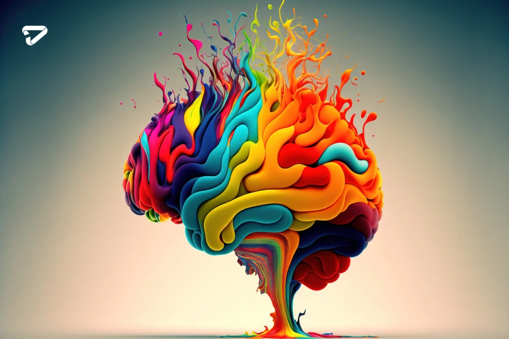
Cultural diversity in graphic design enriches visual communication by incorporating varied cultural symbols and aesthetics, broadening audience engagement and fostering inclusivity.
While personal experiences and cultural contexts shape color connotations, some universal patterns exist.
Like personality archetypes, colors project typical personas:
Red – The Power Player
This bold hue pumps adrenaline, conveying excitement and urgency. Red commands attention, hence stop signs, clearance sale banners, and brands like Coca-Cola triggering thirst.
Blue – The Voice of Reason
The vast sky and ocean evoke openness and calm, reflected in blue’s reliable, professional vibe. No wonder social platforms like Facebook or LinkedIn embrace blue, inspiring our trust.
Green – Mother Nature’s Darling
From lush hillsides to green juice, this hue represents renewal and organic growth. Hearts are beating for wellness, sustainability, and environmental brands.
Yellow – The Sunny Optimist
This cheery color warms hearts, conveying hope and sunshine. Fast food chains like McDonald’s leverage yellow to uplift spirits and appetites.
Purple – The Royal Treatment
Extracting this rare hue in ancient times proved challenging and expensive, hence purple’s enduring elite status.
Violet suggests luxury, evoking romance and nostalgia for brands like Hallmark or Cadbury.

Orange – The Creative Maverick
Combining red’s verve with yellow’s friendliness, orange pumps creative juices while inviting human connection.
No wonder modern brands like Nickelodeon splash vibrant orange about so freely.
These primary color arcs exemplify universal associations.
But context matters hugely. Let’s see how design masters mix color palettes to drive strategic outcomes.
Branding Alchemy – Turning Colors into Gold
Walk supermarket aisles or shopping malls, and product packaging screams competing visual messages seeking your dollars and attention.
Color choices powerfully steer perception, triggering emotional responses that drive behavior as reliably as any hypnotist’s pendulum.
Consider how beverage titans visually distinguish their charismatic brands.
Coke’s deep red bursts with playful yet mature confidence, while Pepsi’s blue pops with youthful optimism.
Mountain Dew amps edginess with lime green, while Starbucks’ soothing green and white suggests a cozy community.
Colors Telegraph’s brand personalities are targeting distinct consumer psychographics.
Or examine household cleaner products.
White and cool blues connote purity for brands like Clorox.
In contrast, disinfectant brands often intensify germ-fighting credibility with clinical greens.
Such major brands demonstrate masterful color psychology techniques for aligning visual communication with positioning and personality.
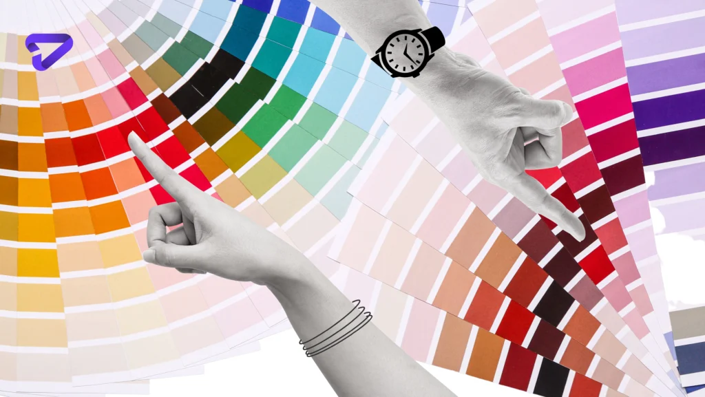
Digital Alchemy – Conjuring Website Magic
Master web designers realize websites are more than digital billboards.
Effective sites strategically guide users through experiential journeys, leveraging interface elements that tap subconscious triggers and cues.
Color choices shape journeys powerfully through psychological influence.
Vibrant red call-to-action buttons irresistibly magnetize attention, conveying urgent priority.
Shoppers perceive discounted prices more appealingly against red backgrounds.
Recognizable common navigational color patterns breed familiarity and orient users, facilitating intuitive transitions between pages.
Unexpected color pairings jar senses through deliberate contrast, selectively directing focus toward or away from elements.
While dark, sleek backgrounds may aesthetically suggest premium appeal, excessively low color contrast risks readability, subordinating form below function.
Relatable color themes and imagery communicate alignment with audience values and priorities.
Pantone’s 2020 selection, Classic Blue, awakens feelings of stability and trustworthiness.
Apple’s website epitomizes strategic color psychology influence.
Crisp product shots glow against black backgrounds like spotlit jewels, heightening appeal through selective focus.
Contrast guides eyes compellingly along journeys toward commercial conversion.
Maintaining signature blue in headings and icons then fosters brand continuity across pages.
Through numerous subtle interface color tricks, Apple facilitates seemingly effortless yet deliberately orchestrated user journeys.
Skilled digital alchemists weave color magic into interfaces, shaping experiences beyond mere utility into enjoyable transformations.
Their potions may appear in plain sight but drip with hidden psychological influence!
The Art of Contrast – Jedi Mind Tricks
Beyond singular hues, manipulations like contrast deepen psychological influence.
Contrast helps highlight, differentiate, and guide visual focus through directional friction.
Crisp black lettering pops clearly from white backgrounds, commanding readability.
The high background-to-text contrast signals “Important information ahead!” driving engagement.
Vibrant call-to-action buttons magnetize attention against subdued surroundings via an isolating spotlight effect.
Photos gain subjective brilliance when counterpoised against dark negative space.
McDonald’s legendary red and yellow brand ID enjoys instant worldwide recognition thanks to high color contrast, cementing its visual penetrance over decades of mass exposure.
But new brands can leverage differences just as powerfully.
Social media site Pinterest uses a strong red logo against clean white backgrounds to urgent effect.
Through skillful contrast tuning, designers Jedi-mind-trick viewers toward desired actions, behaviors, and responses.
But contrast risks overuse. Endless arrays of brightly bouncing icons and ads numb senses, breeding apathy through overstimulation.
Visual shouting leads to ignored cries for help.
Achieving cut-through requires artful restraint, not simply maximum velocity.
Let negative space cleanse palates between contrasting eye-magnets.
Guide through encouraging discovery, not sensory assault. Wield contrast deftly manipulates focus yet respects universal consciousness selectively.
Enjoy the Magic of Color Psychology
Whether selling products, services, or ideas, visual communicators in graphic design ignore color psychology at their peril.
Branding offers perhaps marketing’s highest leverage, yet often gets dictated by personal whims rather than research-backed strategies rooted in human psychology.
Take Coca-Cola’s famous red branding.
Originally just a lucky guess, it proved hugely impactful.
But minus subsequent science validating red’s appetite-stimulating and attention-grabbing powers, they might have switched colors on a passing fancy, losing effectiveness.
While no formula substitutes for creativity, specific timeless psychological patterns enable more scientifically grounded branding and design choices.
Reference this guide when crafting your website, logo, or ad campaign to boost results.
Let color unleash its magical emotional persuasion for you rather than random competitors.
Beyond profit, purposeful designers and marketers can wield color mindfully to better society.
Colors calming anxious medical patients, signage quickly guiding fleeing crowds to safety, or imagery destigmatizing misunderstood groups demonstrate color’s compassionate utility.
Science seeks universal truths but also nuance through continued inquiry.
While general color psychology principles provide bearings, remain open to revising assumptions, ensuring messaging resonates across unique audiences.
Then watch the rainbow shift fortune in your favor.
But more importantly, seeing colors advances collective understanding.
Now that’s true magic! With our graphic design services charlotte, you can experience the true psychology color in your designs.


