Mastering the Art of Typography in Graphic Design
The Art of Typography: Making Words Come Alive
Typography is no small matter in the world of graphic design. Like a frame around a painting, the right fonts can draw readers in, while the wrong ones can make even the most brilliant content seem dull. Join me on an adventure into the heart of typography as we explore what makes this craft tick!
From the hand-drawn manuscripts of medieval scribes to the digital templates of today, working with type has always been about more than just communication. At its best, typography is an art form that makes words jump off the page right into our awaiting minds. Sound impossible? Well, let me walk you through some of the key “brushes” top typographers use to “paint” masterpieces out of humble letters and phrases.
Select Characters That Speak Volumes
Choosing a font is like introducing a new friend into your typographic conversation. You want them to make a solid first impression when readers meet them on the page or screen!
Each font has its visual personality and voice that will speak your message in a particular tone. A fun handwritten script font feels lively and casual. At the same time, a traditional serif like Times New Roman has a more serious, professional vibe. Selecting font characters that set the right tone for your content is essential.

When auditioning fonts for body text roles, make readability the top priority. Test paragraphs are set in different fonts at small sizes like 12-14pts. Do the letters seem clear and comfortable to read in passages, or do they blur together? Times New Roman and Georgia are popular picks for their clarity. They may seem a bit dry, but they speak beautifully to our eyes.
Choose just 1-2 complementary fonts for supporting roles to join your main text face. Too many clashing font personalities can dilute impact, like a scene with too many characters talking over each other. Keep your typographic cast small for clarity.
Establish a visual hierarchy between fonts to indicate levels of importance. Experiment with different sizes, weights, and styles. Give “leading role” status to the critical text, like headings, making them the largest and most stylistically distinct from the body copy. Help set a precise typographic stage for readers to recognize protagonists vs background players instantly.
Remember, fonts speak volumes beyond their content. Choosing the right typographic voice sets the tone your message deserves!
The Epic Saga of Line Width
Remember Grandpa Simpson droning on about his war stories that seemed never to end? Line width has a similar effect! The standard wisdom suggests 50-60 characters per line for the web and 30-40 for mobile. Why, you ask?
Lines that drag on like episodic novels strain the eyes and try our patience as readers. Conversely, lines with too few characters force an awkward stop-and-go rhythm. Like Goldilocks, you want lines that are not too long or short, but juuust right to keep readers engaged from start to finish.

Mind the Gaps – Alignment and Spacing
Remember those ransom letters cut from magazines that look creepy and disjointed? That’s what uneven spacing and alignment look and feel like in typography. Aligning elements to a consistent baseline makes designs look crisp and “put together.” Careful kerning, or spacing between letters, also prevents awkward gaps and collisions that trip up the eyes. Prioritize harmony and readability over flashy gimmicks.
Get Colorized – Typography in Living Color
The advent of color took typography from ho-hum black and white to vivid new dimensions. Explore mood-enhancing hues but make informed choices. Gone With the Wind would have quite a different vibe in neon pink! And be sure color combos sync with branding. Consistency builds trust and recognition…not that you’d recognize Aunt Edna dressed in tie-dye and a mohawk!
Curb Your Typographic Enthusiasm
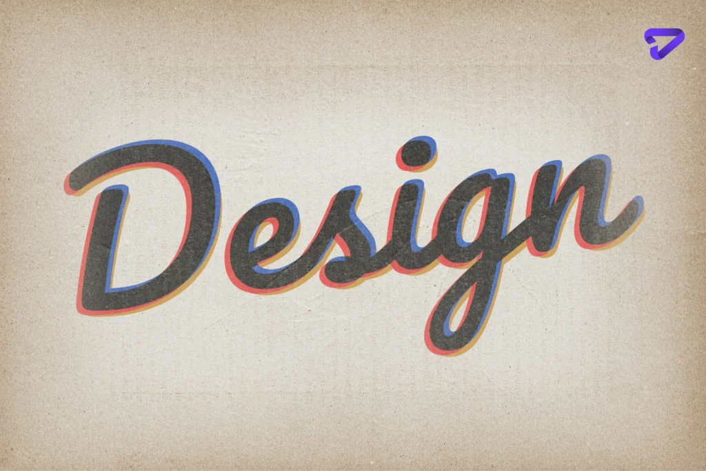
Decorative display fonts seem fun, but use discretion. Ornate scripts, like French Script, feel lively initially but grow tiresome in paragraphs, slowing reading. Reserve showy fonts for short impact, like logos or invitations, while keeping body text simple.
White Space – Don’t Be Afraid!
White space gets a bad rap for being “empty” or wasted. But without intervals between musical notes, songs would sound messy. So, too much visual density overwhelms without the cleansing effect of negative space guiding the eyes from point to point. White space establishes order, hierarchy, and flow. Learning to embrace it is profoundly freeing. Try it!

Choose Your Adventure Through Formatting
Remember reading Choose Your Adventure books as a kid? You felt empowered charting your course! However, too many diversions in body text hinder flow. Research shows that left-aligned body text reads naturally for our left-to-right reading bias. Mix up alignment styles in moderation to keep things interesting while keeping paragraphs left-aligned for ease of flow.
Refine and Refresh – Iterate for Impact!
Remember early drafts of school papers that felt rough and clumsy? Typing “The End” didn’t suffice; good writing takes work! Similarly, excellent typography requires continually fine-tuning sizes, spacing, and flow until satisfied. Test across devices to ensure quality. Like a blacksmith hammering out fine silver – keep perfecting your craft through iteration. The results will shine.
Choose Your Typographic Voice
Beyond style preferences, font categories suggest certain voices to amplify messages:
- Serif fonts like Times New Roman use decorative “feet” that imply a traditional tone – fitting for conveying gravitas and reliability in long-form settings like books or articles.
- Sans-serif fonts like Arial present a modern minimalist edge suitable for clean contemporary designs in need of direct visual simplicity.
- Script fonts mimic handwriting for a personal, quirky flair apt for invitations, logos, or display text meant to feel intimate.
- Display fonts grab attention with bold shapes tailored for high-impact situations like ads or posters wanting to stand out while conveying visual excitement.

Let Your Words Dance Off the Page!
So, as you can see, typography done well makes written words shine. It invites readers to listen to what our designs have to say and how they choose to say it, making absorption enjoyable. Typography turns communication into a visual dance animated by the love of language and the structures that give words dimension. Remember the power words have when skillfully composed and beautifully framed. Let this guide inspire you to make your words waltz elegantly across the page. Try our graphic design services charlotte to be mesmerized!


