The Role of Typography in Effective Web Design
Typography in Effective Web Design is crucial for creating a visual hierarchy, setting the tone of the website, and ensuring that information is both accessible and engaging to users. How come some websites become your favorites for reading and catch your attention right away? Because of their texts. Getting a visitor’s attention on a website depends on the text element.
Typography contributes to the way users read and understand web content. Typography is a crucial factor in attracting the audience’s attention on a blogging site or service profile.
Thus, following the suggested methods and understanding its significance is one of the easiest ways to build a better online experience for your customers.
Typography – What is it?
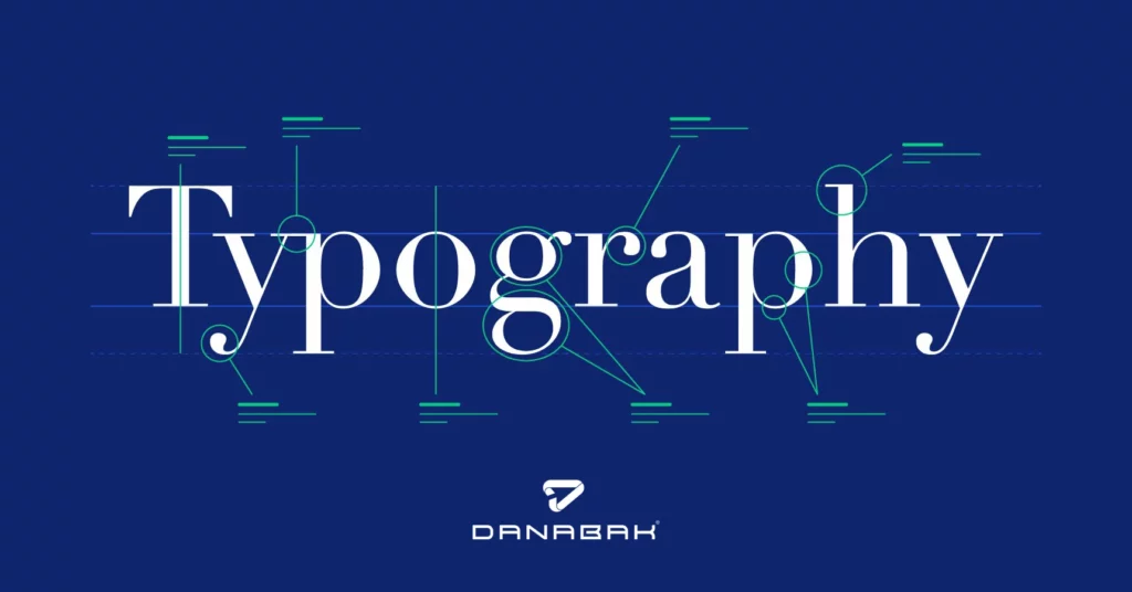
Typography is the art of arranging letters and text in a way that makes the copy legible, clear, and visually appealing. With an aim to encourage certain emotions and communicate a range of messages, it will include appearance, structure, and font style. Text comes to life through typography.
Typography is mostly associated with digital communications and print today. In recent years, the internet has spawned a creative explosion in typography, giving web designers a wide range of types and fonts to choose from.

The best typography practices for designing amazing websites
If you want to design a fantastic website with typography, consider the following best practices. Experts recommend the following tactics for building an incredible web design using typography:
1. Choose the right typeface
Use typefaces that suit the website’s purpose, target audience, and overall design. You can create visual contrast and hierarchy by choosing legible fonts of different weights and styles.
2. Limit the choice of typefaces
Maintain visual consistency and coherence throughout the website by sticking to a few typefaces (typically two to three). The use of too many typefaces can result in a cluttered and confusing design.
3. Create a hierarchy
To establish a clear visual hierarchy, use variations in font size, weight, and style. It is important to distinguish important headings from subheadings and body text.
4. Make sure the text is readable
The font size should be appropriate and the contrast between the text and the background should be adequate to make the text easy to read. Users with visual impairments should avoid small font sizes that strain their eyes, and color contrast should be sufficient to ensure readability.

5. Alignment with mindfulness
To create an organized and cohesive appearance, align text elements consistently. Alignments can be left-aligned, right-aligned, centered, or justified, but excessive justification may negatively affect readability.
6. Make sure your typography is responsive
Ensure text is responsive to different devices and screen sizes by using responsive typography techniques. Media queries and fluid typography can help maintain optimal legibility and readability.
7. Ensure consistency
Maintain consistency in typography throughout the website. Make sure that fonts, sizes, spacing, and other typographic elements are consistent across all pages.
8. Conduct an accessibility test
Make sure typography choices meet accessibility guidelines. Make sure the color contrast ratios are correct, provide alternative text for non-text elements, and allow users to adjust font sizes as needed.
Typography’s four main typefaces
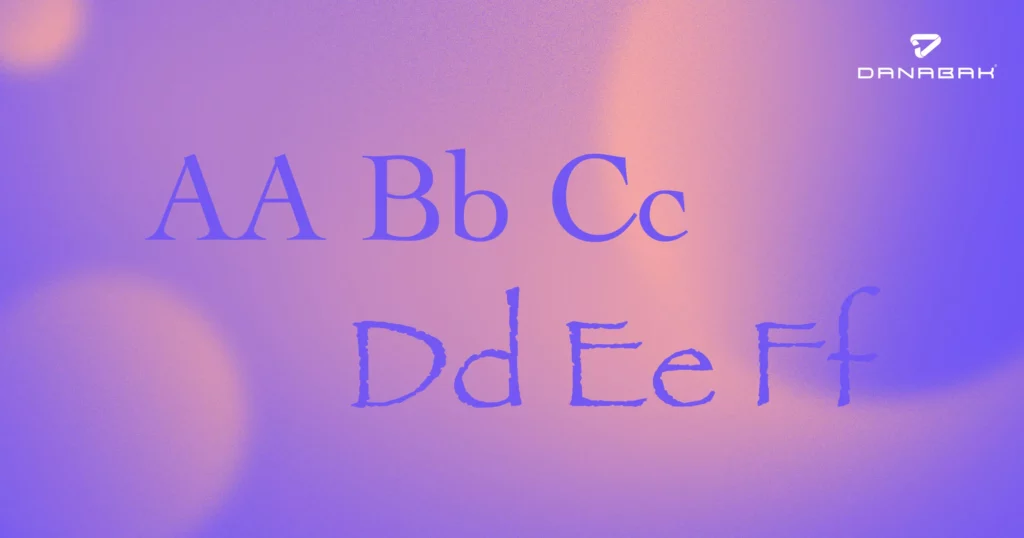
A typeface influences the atmosphere, tone, and visual layout of every text you read on a screen. Typefaces have many different sizes and weights of letters, whereas fonts are graphical representations of text structure. On the web, you’ll often find four main types of typefaces:
- Serif
- Sans serif
- Slab serif
- Script.
The most commonly used typefaces on the web are serif and sans serif. Serifs are more traditional, consistent, and official. Long paragraphs are easier to read. For web design, sans-serifs render well on low-resolution displays and are more casual and simple than serifs.
With its most important feature being thick and bold, the slab typeface is meant to grab attention. For special occasions such as prominent headings, etc., script typeface should be kept for imitating the varied and dynamic handwriting strokes.
For a website, what is the best font size?
A website’s font size depends on many factors, including font type, content structure, target audience, and overall design. The following guidelines can help determine an optimal font size for a better user experience:
Readability
Ensuring that the content is easy to read is the primary objective. It is generally considered comfortable for most users to use font sizes between 16 and 18 pixels for body text. For older audiences or people with visual impairments, larger font sizes may be preferred.
Line Spacing
Readability depends on appropriate line spacing (also known as leading). Generally, 1.5 to 1.6 times the font size is recommended for line spacing.
Contrast
Make sure the text and background have sufficient contrast. For users with visual impairments, high contrast improves readability.
Designing for responsiveness
Due to the prevalence of mobile devices, responsive design is essential. To accommodate different screen sizes without sacrificing readability, font sizes should be scalable.
Fonts for headings and subheadings
To create a visual hierarchy and make important information stand out, use larger font sizes for headings and subheadings. Headings are usually 24 to 36 pixels in size.
A user test
You should conduct user testing and collect feedback from your target audience in order to determine whether or not the font size is comfortable for them to read. It’s essential to consider the specific needs of your users.
Accessibility
To accommodate users with visual impairments, consider accessibility guidelines such as the Web Content Accessibility Guidelines (WCAG), which recommend a minimum font size of 16 pixels.
Body text on a website should be 16 to 18 pixels in size, ensuring readability and catering to a wide audience. To create a great reading experience for your website visitors, consider font type, content structure, and user preferences.
Final Thoughts
There has always been a strong emphasis on typography as a fundamental element of graphic design, and it will serve as one of the core principles of any good website design for many years to come. The reason for this is that without good typography, no piece of content is going to be readable or visually appealing. It is therefore critical that if you want your web design to be engaging for users, you must focus on improving its typography in order to achieve that! You also have the option to enlist the help of Charlotte Website Design Agency to ensure your website design aligns perfectly with typography principles.
For more information please follow us on Instagram and Facebook.


