The Role of Microinteractions in User-Centered Design
The Irresistible Allure of Microinteractions: How Tiny Design Details Hook Users and Forge Emotional Bonds
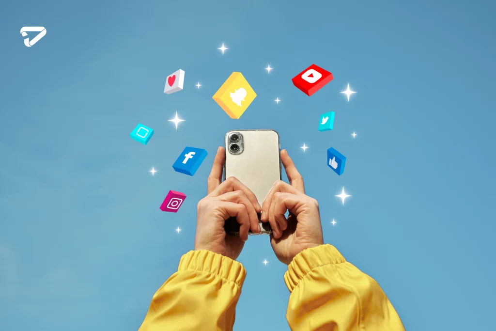
That “Like” button. It was such a tiny finger tap, yet so delightful. With just the slightest touch, a crimson heart blooms on screens worldwide. And in that instant, a spark of joy lights up brains, brightening days and forging bonds within communities.
Who knew a humble microinteraction like a heart animation could wield such influence? Yet these bitesized bursts of user interface magic profoundly impact our digital lives beyond their modest scales.
This article unveils why microinteractions captivate users, from their innate psychological appeal to their branding superpowers. You’ll also discover real-world examples, from vividly animated icons to concealed interface scripts, that charm users through emotional design.
Defining Microinteractions
Microinteractions refer to contained moments of user engagement within broader digital experiences. These miniature user interface elements enable quick tasks, like when you:
- Tap a play button to start a video
- Double-click a social media post to “Like” it
- Scroll through pages
- Swipe left to delete
They often incorporate:
- Clickable buttons
- Icons
- Menus
- Progress indicators
- Transitional animations
- Popup notifications
Microinteractions allow users to digest overwhelming digital experiences through well-paced interaction “bites” rather than getting overwhelmed by massive, impenetrable screens.

The Satisfying “Loop” of a Microinteraction
Every microinteraction loops through distinct stages:
- Trigger – An action initiates the sequence, like tapping an icon
- Rules – Events follow triggers based on coded parameters
- Feedback – Visual, haptic (touch), or audio responses confirm the rules execute properly
- Modes – Some have special rules during repetition, like scrolling
For example, tap the play icon “trigger,” and the song plays according to coded “rules.” Visual waveform animations deliver “feedback” of the music occurring per expectations.
Remove any piece of this loop, and microinteractions break down, confusing users. But when all elements align seamlessly, microinteractions flow effortlessly.
Microdelight: The Art of Emotional Design
Beyond barebones utility, stellar microinteractions provide aesthetic and emotional rewards by “microdelighting” users through sensory pleasure and positive psychological responses.
For example, bubbly celebration animations after completing the questionnaire steps gratify us. Or delightful sounds, like playful Mario coin clinks, give updates without annoying disruptions.
Top microinteractions even elicit potent primal and social responses. Instagram’s heart animation leverages approval-seeking social wiring with visual softness signaling safety.
Uber’s splashy confetti after booking ignites anticipation for fun nights out, appealing to our hardwired drive for play and adventure-seeking dopamine hits.
Microinteraction delicacies form the crowning touch, separating good digital experiences from great ones.

The Branding Power of Microinteractions
Leading brands embody identities through sensory microinteraction signatures across their platforms. For example:
- Apple flows elegantly like liquid metal
- Google feels helpful and functional
- Starbucks bubbles with cheerful energy
Even stalled loading wheels feel uniquely “Google” thanks to branded microinteraction styling.
These signature UX flavors forge emotional connections, helping consumers form bonds with brands. Users crave microinteraction patterns they associate with beloved brands, like intrinsic sensory cues. No wonder 68% of respondents in one study chose companies with more cohesive brand languages across interfaces over scattered options.
Microinteractions in the Wild
Let’s explore some microinteraction examples that charm audiences worldwide:
Social Media
- Twitter’s featherweight heart icon pulses upon liking Tweets
- LinkedIn’s reassuring progress bar shows connection requests sending
- ** Entertainment**
- TikTok’s infinite scrolling video cobblestones you can’t stop turning
- Netflix’s increasing episode counts pressure marathon viewing
- Fortnite’s visual pings and explosions celebrate level-ups

E-commerce
- Sephora’s lipstick try-on allows virtual makeovers.
- Target’s soothing confirmation chime after adding items to the cart
- Etsy’s charming paper crinkle sounds like opening digital gift boxes
Transportation
- Lyft’s cotton candy streak animation on pickups
- Uber’s splashy confetti raining on booked rides
Microcopies: Tiny Interface Texts, Huge Impact
Beyond eye-catching animations, microinteraction power comes from tiny text snippets guiding users behind the scenes. These “microcopies” include:
- Button labels
- Menu options
- Tooltips
- Error messages
- Loading progress updates
- Confirmations
Though microscopically small in scale, they provide outsized utility. Menu options like “Save” directly enable tasks. While reassuring confirmation notes, like Slack’s “Message sent!” prevent user uncertainty.
Tone and personality shine, too. Evernote’s playful loading messages like “Finding pencil graphite…” build rapport. While no-nonsense LinkedIn error notes ensure professionalism.
So, despite their miniature stature, these textual microinteractions inform users and shape brand voices behind every digital experience.
Why Microinteractions Hook Users?
Microinteractions wield incredible influence because they intrinsically appeal to fundamental human psychological needs and wiring.
Our brains crave rich, multisensory environmental interaction for learning and stimulation. So microinteractions help fill this void where physical inputs fall short in digital worlds, allowing visual, auditory, and even haptic touch feedback through phone vibrations.
Microinteractions also leverage our innate love for games and visible progress. Points, rewards, completion percentages, etc., sprinkle little dopamine “joy sparks,” nudging engaged focus like snacks for the attention span.
We even have social wiring that responds to microfeedback cues. Twitter’s heart animation leverages innate approval-seeking social drives when Tweets resonate.
Well-crafted microinteractions help digital environments feel more intuitively human through emotional design. Tiny taps, flickers, and sounds might go unnoticed, but their impact on experience sticks subconsciously.
And when brands consistently meet user needs through sensory delights, they forge lasting bonds and preferences. Hence the “Addictive” nature of perfectly aligned microinteractions.

Micro Moments, Macro Impact
In today’s increasingly digital age, stellar user experience separates the best from the rest. And within experiences, microinteractions discreetly influence outcomes behind the scenes through emotional design.
So the next time you “Like” a post or feel that satisfying smartphone vibration, don’t disregard those microinteraction moments. Tiny taps and animations sway macro results when sculpting user engagement and brand loyalty. The devil is in the details.

Conclusion
The unsung heroes of user-centered design are microinteractions that create engagement, ease of use, and emotional connections. Such minor interactions as the “Like” button on social media or the “Add to Cart” function on e-commerce pages lead users to inform and simplify complicated chores. As such, it is vital to acknowledge and develop their significance carefully to make smooth and enjoyable user experiences. Microinteractions are important in user-centered design, and you can rely on graphic design services Charlotte.


