


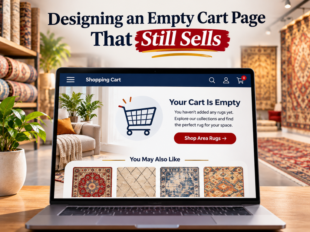
An empty cart page is often treated as a technical state rather than a selling page. The customer reaches /cart, the system finds no products, and the page displays a short message such as “Your cart is empty” with a button returning to the homepage. That solves the technical requirement, but it wastes a moment when the shopper has shown enough buying intent to visit the cart and may still be willing to continue browsing.
For a rug marketplace, an empty cart can happen for several reasons. The shopper may have removed an item, returned after the cart expired, opened the cart on another device, followed an old browser tab, or attempted to revisit a one-of-a-kind product that has since sold. We therefore design the page as a recovery state. The goal is not to pressure the customer into buying immediately, but to give them the shortest useful path back into products that match what they were trying to do.
Start With a Clear Empty-State Message
We first confirm the situation plainly. The page should make it obvious that there are currently no items in the cart.
We avoid messages that imply the customer made a mistake or use overly playful copy that hides the state. A simple heading such as “Your cart is currently empty” followed by a helpful next step is usually enough.
The customer should not need to wonder whether products are still loading or whether the cart system failed.
This clarity becomes more important when the user expected a saved product to be there.
Give the Shopper an Obvious Way Back Into the Catalog
The first action should help the customer resume shopping.
We prefer a meaningful destination such as “Browse Rugs,” “Continue Shopping,” or a return to the most relevant collection rather than automatically sending everyone to the homepage.
If the marketplace has a strong central product directory, that can be the default route.
For more advanced implementations, the link can return the customer to their previous collection or search state, provided the behavior is predictable and does not create confusion.
The empty cart should reduce the number of decisions required to get back to relevant inventory.
Put Search Where the Customer Can Use It Immediately
A customer who opened the cart may already know what they were trying to buy.
Instead of forcing that person through menus, we can provide a prominent search field on the empty state.
This works particularly well for rug marketplaces where users may remember a style, size, SKU, city, dealer, or collection but not the exact navigation path.
The search should support useful language rather than requiring exact catalog terminology.
Our broader guide to rug website search explains why search becomes more valuable as inventory and taxonomy complexity increase.
Restore Cart Items When Technically Appropriate
An empty cart page should not be used to solve a cart-persistence problem cosmetically.
If customers frequently lose carts after signing in, switching devices, accepting cookies, or returning within a short period, we investigate whether the ecommerce platform can preserve appropriate cart state.
Baymard’s 2026 ecommerce audit guidance notes that many customers use the cart as a temporary storage and comparison tool and recommends checking whether the site supports save and recovery behavior.
For rugs, this behavior is especially plausible because purchases can require measurement, discussion with another person, or comparison across several products.
The ideal solution may be preserving the intended products rather than simply designing a more attractive empty page.
Connect the Empty Cart With the Wishlist
Wishlist and saved-product functionality can create one of the most useful recovery paths.
If a logged-in shopper has saved rugs, the empty cart page can provide a clear route back to those products. We do not automatically move saved items into the cart because saving does not always indicate immediate purchase intent.
For one-of-a-kind rugs, we also make availability visible. A saved rug may have sold since the customer last visited.
Our guide to wishlist and reservation is relevant because a wishlist should never imply that unique inventory has been held unless the site has an explicit reservation system.
Show Recently Viewed Rugs When Appropriate
Recently viewed products can be more useful than generic bestsellers because they reflect the customer’s own browsing history.
If the necessary data can be used appropriately under the site’s privacy and consent setup, the empty cart may show a small group of recently viewed rugs with current availability.
We keep this section focused rather than displaying twenty products.
The purpose is to help the shopper recover context, not transform the empty cart into another full collection page.
If a previously viewed unique rug has sold, we can label it accurately and provide similar active options rather than pretending it remains available.
Recommend Collections Instead of Random Products
When we do not know enough about the shopper’s history, broad collection links often work better than random product recommendations.
We may offer common starting points such as Persian Rugs, Modern Rugs, Vintage Rugs, 8×10 Rugs, Wool Rugs, or another set supported by actual marketplace demand.
The selection should reflect the catalog and the site’s highest-value shopping paths.
We avoid creating a grid of whatever products happen to be newest when those items do not help the customer make a category decision.
An empty cart can function as a small merchandising hub, but it should remain simpler than a homepage.
Use Buyer Intent to Choose Recommendations
If the site has reliable contextual information from the current session, we can make the empty state more relevant.
A shopper who spent most of the session browsing round rugs does not need the same recommendations as someone viewing antique Persian rugs.
We can use the current collection, search term, recently viewed category, or other appropriate first-party context to guide the recovery path without pretending to know more about the customer than we actually do.
Relevance matters more than the number of recommendations.
Avoid Aggressive Discounts as the Default Fix
An empty cart does not automatically mean price caused the customer to leave.
The cart may simply be empty because the shopper removed an incorrect product or returned through an old link.
Offering a large discount immediately can train customers to expect incentives and unnecessarily reduce margin.
We prefer making product recovery and browsing easier first.
Discounts can still be part of a broader promotion or abandonment strategy when the economics support them, but the empty state should not become a permanent coupon dispenser.
Explain Free Shipping or Returns Only When It Helps
The empty cart can reinforce important purchase reassurance, but we keep it concise.
If free shipping is a meaningful store-wide benefit, a short line may help the shopper continue. The same applies to a strong return policy, showroom support, or trade program when those benefits genuinely influence buying decisions.
We avoid filling the page with trust badges and marketing claims.
The customer’s main task is finding a product again.
The page should support that task rather than delay it.
Design for One-of-a-Kind Inventory
A rug marketplace needs to consider what happens when the item the customer expected to find has sold.
If the system knows that a previously carted unique product is no longer available, simply displaying “Your cart is empty” loses valuable context.
A better state can explain that the item is no longer available and offer closely related inventory based on size, style, origin, color, or price.
We must be careful not to claim that another rug is an exact replacement when one-of-a-kind products genuinely differ.
The recommendation should help the customer continue the search rather than hide the reason the original cart changed.
Do Not Let Sold Inventory Create a Silent Empty Cart
Unexpected cart removal damages trust.
If a unique rug becomes unavailable because another customer purchased it, the user should receive an understandable explanation instead of seeing an empty cart with no reason.
This is particularly important when availability can change between devices or sessions.
We distinguish between “your cart is empty” and “an item from your cart is no longer available” because those states communicate different information.
Clear status protects trust even when the store cannot preserve the sale.
Let Customers Contact the Store
High-value rug shoppers may prefer human assistance after losing a product or becoming unsure about alternatives.
The empty cart can include a secondary path to contact the store, especially when the business offers consultations or showroom support.
We do not make this the only next step because many customers still want to browse independently.
The contact option simply gives shoppers another recovery route when the purchase requires more help than a recommendation engine can provide.
Consider a Designer or Trade Path
A marketplace serving interior designers may have users who are not ready to place a consumer-style checkout order.
If trade accounts are a major business model, the empty cart can provide a subtle link to the relevant program when context makes sense.
We avoid turning every empty cart into a trade-program advertisement.
The page should reflect the most common customer journey first and provide additional pathways second.
Keep the Empty Cart Visually Light
An empty page does not need to contain every marketing module the company owns.
We usually prefer a clear message, primary shopping action, search, and one or two relevant recovery sections.
Too many banners, categories, products, blog links, loyalty prompts, financing messages, and newsletter forms recreate the same decision overload we are trying to solve.
The empty cart should feel like a helpful reset.
Make the Mobile Version Particularly Simple
The page may appear very different on a phone because recommendation grids, search, navigation, chat, and sticky banners compete for limited space.
We test whether the primary continue-shopping action appears early, whether search is easy to use, and whether product cards remain readable.
If recently viewed items appear, we keep the number manageable.
A mobile customer who reaches an empty cart should be able to restart shopping with one obvious action rather than scroll through several screens of secondary content.
Do Not Remove the Cart Icon Just Because the Cart Is Empty
The sitewide cart icon should behave predictably whether it contains products or not.
We do not hide it when the count reaches zero because returning users may intentionally click it to check whether something is saved.
Consistency helps customers understand the site’s navigation.
If the cart count displays zero, that state can be enough indication without changing the location or function of the cart control.
Use the Empty Page to Catch Technical Problems
A sudden increase in empty-cart page views can indicate more than customer behavior.
It may reveal broken cart persistence, expired sessions, cross-domain checkout issues, theme updates, cookie changes, JavaScript problems, or links that send users to the cart when no product was successfully added.
We therefore track empty-cart page views and investigate meaningful changes.
A beautifully designed recovery page should not hide a technical problem causing customers to lose items.
Track Recovery Actions
We measure what users do after seeing the empty state.
Useful actions can include returning to products, using search, opening recently viewed items, viewing the wishlist, contacting support, or adding another product to the cart.
The goal is not simply increasing clicks on the page.
We want to know whether the empty state successfully returns customers to meaningful shopping behavior.
If most people leave immediately, we review whether the suggested routes are actually relevant.
Connect Empty Cart Design With Abandoned Cart Strategy
An empty cart page and an abandoned cart email are different tools.
The empty state helps a customer who is actively on the website but has no current cart items. An abandoned cart message can remind an identifiable shopper about products left behind after they leave.
Shopify’s current abandoned-cart guidance recommends showing the actual abandoned products and providing a clear return-to-cart action when the business sends those messages.
We coordinate the two experiences so an email does not send someone back to a cart that immediately appears empty because persistence is broken or inventory changed without explanation.
Avoid Making the Empty Cart an SEO Landing Page
The empty cart serves users, not search demand.
We do not add long keyword-focused copy to the page or try to make /cart rank for commercial rug searches.
The real SEO opportunities belong in category, product, marketplace, and editorial pages where searchers can find useful inventory and information.
The cart should remain focused on transactional usability.
For a marketplace, that separation also helps keep crawlable commercial content distinct from utility pages that exist to support the purchasing process.
Use the Same Design Principles as a Strong Cart
Baymard’s cart research shows that customers use carts to review items, understand cost, edit selections, and sometimes temporarily store products. An empty cart page should respect the same underlying need for control.
When the products are gone, we give the customer clear next options rather than treating the page as the end of the journey.
That can mean continuing shopping, searching, reopening saved items, reviewing recently viewed products, or contacting the store.
The design should answer “What can I do now?” immediately.
Final Thoughts
An empty cart page does not need to become a complex sales page to contribute to conversion. It needs to recover the shopper’s context and make the next useful action obvious.
For a rug ecommerce business, that often means clear empty-state messaging, a direct route back to inventory, strong search, wishlist access, recently viewed products, relevant collection recommendations, and special handling for one-of-a-kind rugs that have become unavailable.
We also monitor whether customers are reaching the page because of normal behavior or because the cart is failing to persist correctly. Baymard’s recent ecommerce UX guidance specifically identifies cart recovery and temporary-storage behavior as important parts of cart usability.
The best empty cart page does not try to persuade the customer with every available marketing tactic. It reduces the distance between “there is nothing here” and “I found another rug I want to consider.”
FAQs
What should an empty cart page include?
We recommend a clear empty-state message, an obvious continue-shopping action, useful search, and selective recovery options such as saved or recently viewed products when those features are available.
Should an empty cart page show product recommendations?
It can, but relevance matters. Recently viewed products or relevant collections usually provide more value than a random bestseller grid.
Should we offer a discount when the cart is empty?
Not automatically. An empty cart does not prove that price caused the shopper to stop. We first make product recovery and browsing easy before using margin-reducing incentives.
What should happen when a one-of-a-kind rug in the cart has sold?
We prefer explaining that the product is no longer available and showing relevant alternatives instead of silently removing it and leaving the customer with an unexplained empty cart.
Should empty cart pages be optimized for SEO?
The page should primarily serve the shopping experience rather than organic search. We focus SEO efforts on useful product, collection, marketplace, and editorial pages rather than trying to rank a utility cart page.